Who moves together. Many assets move in a similar way, because they're under the same market mood or the same robots. When you compare the tops and bottoms of similar assets, you can see who is stronger and who is weaker.
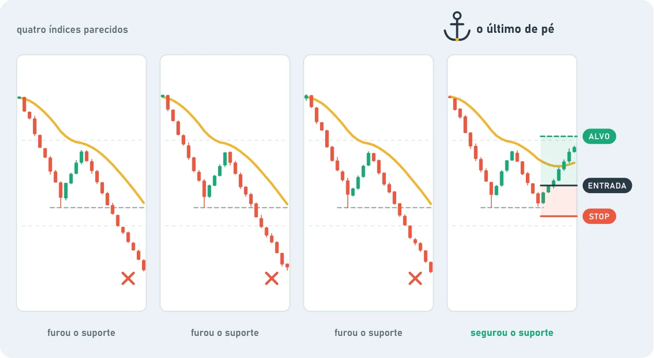
Relative strength. Two similar assets fall together. One makes a new low, the other holds its support. The one that held is showing relative strength. The same goes when one gives back much less than the other in a pullback.
Relative weakness. The opposite: one breaks down while the similar one is still holding. The one that broke is weak.
Strong with strong, weak with weak. Many traders look to buy strength and sell weakness, instead of treating everyone in the same group as if they were the same. It's not a rule: it's a way to look at the group before choosing.
The ratio chart. Most platforms let you divide one asset by another and see the result as a chart. If the ratio chart goes up, the top one is stronger than the bottom one. If it goes down, it's weaker. Everything you already know works on it: trend, moving average, trendline, RSI.
on the ratio. A special case: the asset makes a lower low, but its ratio chart against the index makes a higher low. It's falling, but falling less than the rest. That's hidden strength.
The last one standing. Follow four similar indexes. If three break down and get very oversold, but one keeps holding its support, that one is what a lot of people watch for when things turn.
High reward is not high probability. Trying to catch the exact moment the weak one turns strong can pay a lot, but it hits less often. It works better when there's confirmation: the support held, the trend changed, the ratio broke the structure.